Friday, April 29, 2011

Button...Button...Who's Got the Button?

Hello, all! This is just a real quick post about an altered canvas that I created for the Too Much is Not Enough challenge at scrapbook.com and for the Punky Scraps Challenge 14 to use canvas. I had a lot of fun with this project because it let me use paint, which I don't use often, and some mists. I will probably do more of these. Lol!

Janie - Altered Canvas. I loved using all these buttons and coating then with paint to make them all one uniform color for a background. It gave me a blank canvas, no pun intended, for the mists I ended up using: Tattered Angels Coffee Shop Glimmer Mist, and Lindy's Stamp Gang Mists in Tibetan Poppy Teal and Wild Honeysuckle Coral. Some Prima flowers are in there, Tim Holtz metal photo corners, a bottle cap, as well as some foam Thickers all covered with Ranger Adirondack Pearl Paint.

Janie - Altered Canvas Close Up 1. You can see a couple of the Prima flowers. I used Modge Podge to cover everything and adhere it all to the canvas before painting over it.

Janie - Altered Canvas Close Up. Here is a close up of the misting and photo corner.

post signature

Come one, Come All....

Hello, all! Today I've got a page to share that I had a lot of fun creating. Until recently I had never been to a circus; neither had any of my family so when the circus came into town we all took the opportunity to go. I had a lot of fun there and so did my family. The one person that most impressed me was the Ring Master. Her style was amazing and so I took a couple of pictures of her. This page shows her, although the photo is a bit dark. I used my April Scraps of Darkness kit for this page since it had the right amount of drama and the perfect colors for what I wanted to do.

Center of the Ring Layout. For this page I used my April Scraps of Darkness kit with its Bo Bunny Time piece papers and beautiful embellishments like Zva creative bling, Prima flowers and awesome stick pin. I dyed some flowers from previous colors using Tattered Angels Scarlet and Coffee Shop Glimmer Mists. I also used Tim Holtz Tiny Attacher to staple mini staples along the edges of the page along with some of TH's journaling tickets. I added some Jolee flourishes and used some circus stamps I've been collecting.

Center of the Ring Close Up. Her you can see some of the stamps I used and the Jolee flourishes. The title letters were stamped, inked with Fired Brick Distress Ink, cut out and had Gold Stickles added. I also added Fired Brick Distress Stickles to the red flowers.

Center of the Ring Close Up. Here you can see a close up of some flowers and the stick pin. You can also see that I doodled some stitching on the edges with a gold pen.

post signature

Tuesday, April 26, 2011

12 Layouts of Alice - Layout #2

Hello, all! Sorry that I did not post my Monochromatic Monday layout yesterday but I have been swamped with finals and have been feeling under the weather. But I will add it to the end of this post, so you don't think I completely forgot about it.

So let's get on with my second layout for my 12 Layouts of Alice. For this one, I went more main stream. I also used alcohol inks instead of reinkers on this because I didn't have the colors I wanted to use in reinkers. But I really like the effect I got with the stamping anyway. Love using the fun foam to get custom ink pads! The only problem with alcohol ink is that you have to work fast before they evaporate.
Tim Holtz's 12 Tags of Christmas 2010 - Tag #2.

Pink Tea Layout. This is my second layout in my 12 Layouts of Alice. I wanted to incorporate some new stamps I got and so decided to use these DCWV papers from the Blossom Song Stack with this photo of my Pink Tea Rose growing in my rose garden. I used Prima flowers and crystal flourishes, some metal foliage from Tim Holtz, Ranger Adirondack Alcohol Inks in Eggplant, Cranberry, and Lettuce. I also used some Liquid Pearls in White Opal and some Worn Lipstick Distress Ink.

A Strong Bong Layout. This is a layout I created for a challenge at DCWV using a sketch by Sketch Savvy. The challenge was to use a certain sketch and any stack of DCWV paper. I chose the Tattered Time stack, which has become one of my all-time favorites. This is my son on the day my husband deployed for Iraq again. My son did not want to leave his side, he somehow knew that his dad would be gone for a long time.

Easter '97 Layout. This is my last Monochromatic Monday layout for this month. This week's color was Easter basket grass green. And going with the grass theme, I punched out a bunch of grass borders for this. The twist was to show some weaving work, so I wove the basket out of some scrap paper. I also made most of the flowers. The bunny is cut out of a photo from the internet.

Easter '97 Close Up. Here is a close up of the basket and some of the flowers. I used a 6 petal flower punch and just scored the middles to fold them in and create this shape.


post signature

Friday, April 22, 2011

12 Layouts of Alice - Layout #1

Hello, all! This is a special post. I want to start by saying that I love Tim Holtz, his techniques and his products. I've always wanted to complete the 12 Tags of Christmas but never have the time around the holidays. Last year, I saw the 12 Tags of Valentine's Day that my friend Linda over at Studio L3 did and wondered to myself why I couldn't make my own project like that. I took something I love - Alice in Wonderland, and made that my theme; and since I don't usually do tags, I decided to make 12 Layouts. I take each tag of Tim's and look for inspiration from his techniques and products to complete a page. Now, I was pondering about doing this project again and was looking at when I posted my last 12 Layouts of Alice projects. I noticed that I began them on April 22, which happens to be my late mother's birthday. So I thought what a great way to celebrate her birthday, which is also Earth Day, and a way of making it my own tradition instead of the tags.

So welcome to the second annual 12 Layouts of Alice! And I hope you will like what you see. I will be posting one layout today and one or two layouts each Tea Time Tuesday until the 12 are finished. Thank you all for being a part of this with me.

Tim Holtz's 12 Tags of Christmas 2010 - Tag #1.

Break Free Layout. Using my April Scraps of Darkness kit and pieces from previous kits, I created this page of my eldest daughter. When I saw the house on Tim's tag, I immediately thought of when Alice is trapped in the White Rabbit's house because she's too big to get out. That reminded me of my daughter always anxious to move out and be an adult. So here is my take on the tag and my daughter's attempt to break free. The papers are all from the Bo Bunny Timepiece Collection. I used some TH masks, Distress Inks in Walnut Stain and Vintage Photo, TH Sizzix dies, a TH ticket and Salvage Stickers, and some Petaloo, Prima, and silk flowers. I used some clock stamps from my stash and the Fiskars Fence border punch.


post signature

Wednesday, April 20, 2011

Whatever Wednesday 4-20-2011

Hello, all! I have to laugh at myself today because I completed not one, but two, layouts for challenges that won't count in those challenges because of some mistakes I made! Lol! Okay, you know that each challenge has its own set of criteria and if you don't follow those you can't enter a layout so here are my two flubs.

Sketchy Thursdays Sketch for 4-14-2011.


Duck Hunter Layout. This page is based on the Sketchy Thursdays Sketch for 4-14-2011. I decided to do a one page layout instead of a 2 pager. I loved how the bigger picture was on one side with the other photos making a row that lined up with it. I used Echo Park A Walk in the Park papers. I also used some green rik rak from one of my SOD kits, some yellow vinyl Thickers, my Cricut to cut out the grass and duck. I originally created this layout for the Punky Scraps Blog Challenge but their criteria for the challenge was using green, orange, and yellow with only one patterned paper. I forgot about that little detail! Lol!

Punky Scraps Challenge 13 Sketch.

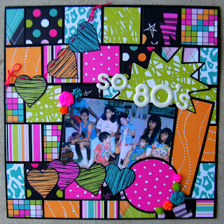
So 80's Layout. This layout was for the Colour Challenge at scrapbook.com which was to use Neon colors and an optional white background. Well, I didn't know that black was not allowed! Lol! The page is based on the Punky Scraps Sketch for Challenge 13. I used some American Crafts Teen paper, Thickers, and some awesome neon resin flowers I bought at Michael's.

Well, the good thing is each layout was meant for two different challenges and so they are still good for one each! And I can always look at it as getting pages done!


post signature

Tuesday, April 19, 2011

Tea Time Tuesday 4-19-2011 & A Friend's Blog Giveaway

Hello, all! I am getting closer to finishing this college class that has me knots! So I am happy for that. Lol! Welcome to another Tea Time Tuesday! I have a layout to share that I created for a couple of challenges. One of those challenges is the Altered Alice Challenge which was to use the colors yellow and blue. The other challenge this page is for is the ABC Challenge at sb.com where the A stands for April (must have a photo taken in April, the year doesn't matter), B is for Big (something big on the page), and C is for Cornflower Blue.

Egg Hunt layout. This is my son on Easter (April 4, 2010) with a very large White Rabbit with the main colors of cornflower blue, yellow, and white! I used some clear stamps of mushrooms, different ribbons, my new Martha Stewart Checkerboard border punch, Thickers, Prima and Petaloo flowers, Stickles in Yellow and Baby Blue, and a very large photo of a White Rabbit doll.

The new Design Team Members over at Scraps of Darkness are Karen aka Lostcoastscrapper, C Mom Go aka Cheryl Casas, and Renea aka Reneabouqets! All the DT's links are on the top right side of my blog!
I also wanted to let you all know about a great giveaway my friend and fellow Scraps of Darkness Design Team Member, Cheryl Casas of Cheryl's Passion Blog, is having on her blog! She was just announced as a new team member and want to celebrate by offering a $15 gift certificate to the Scraps of Darkness Shoppe. Here is what she has to say and how to enter the giveaway!

Hello to all my friends...I am so thrilled to announce that I made the official DT for Scraps of Darkness!! This is like a dream come true for me. And to celebrate this awesome news, I would like to sponsor a blog giveaway. The prize is a $15 gift certificate to the SOD shoppe. So this is what you do:


1. Be a follower of mine and leave a comment on this post.


2. Be a follower of SOD's blog and all of the other DT (the links are on my sidebar).


3. One random person will be drawn up at the end of the day on April 30th. So check back to see if you won! You must claim your prize within 3 days after the announcement.


We love your support so this really puts warmth into our hearts, that we can share our creations with you. The official reveal day is every 15th of each month. See you soon.
 
post signature

Monday, April 18, 2011

Monochromatic Monday 4-18-2011

Hello, all! I can't stay long but wanted to drop off my Monochromatic page for today. I have a lot of assignments for my class and not much time to finish them! This week's color is Lilac Bush Purple with the twist of adding as many butterflies as you can.

Cuteness layout. This is a photo of my youngest daughter with our dog, Attila, when he was a puppy. He was such a darling little thing! To get as many butterflies as I could on this page, I stamped the background full of them then cut some in various sizes to glue on. I also stitched some flowers onto the paper using my Bazzill In Stitch'z templates and some purple embroidery floss. The flowers are Prima and 7 Gypsies (Thanks to Pat aka Gentlewood Farms for those!).

post signature


Friday, April 15, 2011

~*~Scraps of Darkness April Reveal~*~

Hello, all! Here we are on the 15th again for another Scraps of Darkness Reveal! April's kit has to be my favorite so far! And if you know me even a little, you know that it is because of all the clocks on these papers and the fabulously rich colors! This month's kit is called Foundations and is filled with Bo Bunny Timepiece papers, Graphic 45 metal flowers, Shimmerz paints and mists, a Perfect Pearl mist, a cameo, Prima flowers, some miniature amber bottles, Salvage Stickers - Crowded Attic from Tim Holtz, and Zva Creative goodies! No SOD kit ever disappoints and this one just blew me out of the water! I can't tell you how much fun I've had playing with this kit and hope you will hop on over to Scraps of Darkness and take a look at what they have to offer! And be sure to check out the Scraps of Darkness Blog for the most recent news, contests, and inspiration!

Let's start with the awesome and beautiful sketch for this month's kit by Suepup (aka Charlotte).

Scraps of Darkness April Sketch.

Maria Layout. This is my take on the April SOD Sketch. I turned it on its side and did some fussy cutting on the paper. I love the deep reds and browns in this kit along with all the clocks and gears! I inked the papers with Walnut Distress Ink and distressed them with my Tonic Studios Distress Tool. The bling, gears, and some of the flowers were from my stash from some of my previous SOD kits. The photo is of my late mother. This page will be going in my personal heritage album.
Gilmore Layout. What can I tell you....I love those clocks! I fussy cut a bunch of them from one of the kit papers to make this layout. I actually created this layout for a challenge at scrapbook.com. The Scissors, Paper, and Ink Challenge over at sb.com challenges you to use only scissors, paper, and ink (adhesive, too) to create a layout. I took to tearing and fussy cutting my papers. I also used Walnut Stain Distresss Ink on all the edges. The photo is of my father-in-law around the time he met my mother-in-law (A very long time ago... lol).

Innocence Layout. Doesn't yellow remind you of spring and innocence? It does to me and when I found this photo of my great-aunt Bertha that is what came to mind; innocence. This photo was taken before she went to a convent to become a nun. The Bo Bunny Timepiece Home paper with its large door reminded me of a church and I associated that with her. I used moss from the SOD kit to make a little nest for my yellow flowers over an inked, painted, and distressed background. The script and window stamp is from the kit as are the lace trim and Graphic 45 metal flowers. I used Vintage Photo Distress Ink, Golden Wheat Shimmerz paint, and Ranger Perfect Pearls Heirloom Gold Mist. The key is a skeleton key I picked up at the hardware store. The Thickers for the title, some flowers, and ribbon were from my stash.


Defines Me Mini Album Front Cover. I created this mini album for Lisa's (aka Lisanovo) Skeletons in the Closet challenge over at the Scraps of Darkness Challenge Forum. The topic of this month's challenge was "What Defines You?" And since I don't think any ONE thing can define me, I made a whole album full of things that help define me. I made this album with mini paper bags from the hardware store (A photo of the type of bag is at the bottom of this post). Throughout this album I used the papers, cardstock, embellies from the kit along with some other embellishments from previous SOD kits.

Defines Me Mini Front Cover Close Up. In this photo, you can see some Vintage metal corners, Prima mini roses, and 7 Gypsies gears.

Defines Me Mini Album: Pages 1 and 2. On page one I used some Prima stencils and Shimmerz Terra Cotta mist to make the background. I used some Tim Holtz alphas from the Salvage Stickers that came in the kit. My children are the ones in the photo and I believe they are part of the reason I am who I am. Without them I wouldn't be a mother. The 2nd page is of my husband; without him I wouldn't be a wife (or would have learned to be one).

Defines Me Mini Album: Pages 1 and 2 Close Up. I wanted to show you all the little note cards inside the pockets of the bag. This is where I have most of my journaling.

Defines Me Mini Album: Pages 3 and 4. These two pages are of my grandmother and late mother. Without out them I wouldn't have been raised the way I was. My mother's death when I was five also had a great effect on me and has partly made me who I am as well.

Defines Me Mini Album: Pages 5 and 6. These two pages are of my friends. All them mean the world to me and their friendship has nurtured a love more like that of family.

Defines Me Mini Album: Pages 7 and 8. These two pages are dedicated to my youth (or lack of it) and experiences.

Defines Me Mini Album: Pages 9 and 10. These two pages are for time and secrets.

Defines Me Mini Album: Pages 11 and 12. These two pages are for the military (being a military spouse) and for my hobby (scrapbooking and scrap supply shopping).

Defines Me Mini Album: Pages 13 and 14. These two pages are for obsessions and collections (some are one and the same).

Defines Me Mini Album: Pages 15 and 16. These two pages are my education and my life (so far).

Defines Me Mini Album: Pages 17 and 18. These two pages are for extra journaling (on the tags). And let me tell you this is the most journaling I've done in a long time!

Defines Me Mini Album Back Cover. I thought I would put some of my favorite things on the back cover such as the 7 Gypsies Gears, Tim Holtz Gears, and a Tim Holtz Word Key.

Mini Paper Bag. Here one of the paper bags, like the ones I used to make the mini album. It measures 7 inches by 3.5 inches. I got these at my local hardware store in the nuts and bolts section.


Wednesday, April 13, 2011

Whatever Wednesday 4-13-2011

Hello, all! I hope everyone is doing well and having a wonderful day. I just finished a layout for today's Whatever Wednesday and am I so glad to be spending some time in my scraproom. A little pressure is off since I don't have any homework due any time soon. Lol! So today I give you a page I created using the Sketchy Thursdays Sketch for the May Guest Designer Challenge. I thought this was a fun one with the splatter on it. I combined this sketch with a couple of challenges as well; and the Cricut Easter Challenge.

Sketchy Thursdays Sketch for 4-7-2011.

Spring Layout. This is for the Cricut Easter Challenge at scrapbook.com, where we were to use our Cricuts to create anything for Easter or Spring. It is based on the Sketchy Thursday Sketch for the May Guest Designer Challenge. This is my son at the Cameron Park Zoo last Easter. I love this photo because I caught him in midair, mid stride! I used some older paper I had in my stash, Stickles in Yellow and Lime Green, Perfect Pearls Forever Green mist, and some Thickers.
Photobucket