Thursday, April 29, 2010

12 Layouts of Alice - Layout #5

Good morning! So sorry I did not get to this blog yesterday; was swamped with homework and housework! Yuk! So here I am up and refreshed and ready to share another Alice layout. This layout incorporates embossing powders, gold paint, alcohol inks, distress inks, fragment charms, and a photo of me. I wanted to complete a layout that declares all ways are my ways becauce I at least think that's how it is in my house! lol. Enjoy.

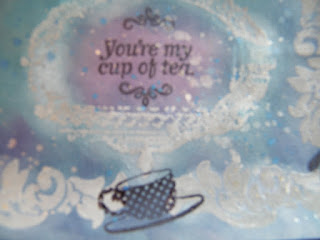
Here is Tim's tag for day #5. For more information about Tim's techniques, products, or 12 Tags of Christmas visit his website at timholtz.com.

All Ways Are My Ways layout. Funny how the camera can change the colors that you see. The reds match more IRL! This is me and my favorite Wonderland character, the Queen of Hearts. We have a lot in common (mostly the quick temper, lol). so I thought it would be good to pair us together.

Close-up of the Queen. I used alcohol ink to color her in then outlined her with a gold marker. I think she looks gorgeous!

Close-up of one of the fragments I made for this layout. I thought hands pointing in different directions was a cute addition.

Close-up of the other fragments for this layout. The ribbon is my favorite with all the suits of cards represented. You can also see that I used black thickers alphas to create the title, which I then covered in gold paint.

Supplies for this layout:
Craft Sheet

Distress Inks- Antique Linen, Vintage Photo,
Distress Embossing Ink
Distress Embossing Powders- Black Soot
Pain Dabber- Gold
Archival Ink- Black
Glossy Accents
Ink Blending Tool
Stickles- Diamond
Heat Tool
Fragment Charms
Sanding Grip
Scissors
Stamps
24 g. wire
Ribbon
White Cardstock
Thickers Alphas

Tuesday, April 27, 2010

12 Layouts of Alice - Layout #4

Hi there! National Scrapbook Day is coming up this Saturday and I am so excited! This will be my first one and I can't wait for the crop at scrapbook.com. It's eight hours long and there will be prizes! Well enough about that or I'm going to get myself hyperventilating thinking about all the fun! lol. Here is the fourth layout in my 12 Layouts of Alice project. This layout involved making one's own stamp pad to get the wonderful color variations and creating a cute little charm. The photos here are all of Easter weekend and they were indeed golden afternoons.


Here is Tim's tag for day #4. For more information on Tim's techniques, products, and 12 Tags of Christmas visit Tim's website at timholtz.com.

On A Golden Afternoon layout. I had a lot of fun with this one; creating my own stamp pad and creating the border and some embellishments with it. The charm was a blast to make and include on this layout.
A close-up of the stamped flowers; background and embellishment (black ones).

I also had fun with the flowers. The flowers on the bottom right corner have the faces of my children on them ala Alice in Wonderland. I saw this done by one of my fellow scrapbook.com members, Lvalent3.


Close-up of the title. I athought varying the colors would be a fun touch and of course, I added stickles to give it some glitz.

Close-up of my charm. The inside says Curiouser & Curioser and instead of regular bells I added a star bell to the bottom. I did not complete the glitter part of the charm because I forgot to order the memory capsule to hold it, so I just skipped that part.


Supplies for this layout:

Craft Sheet

Distress Reinkers- Assorted Colors (pink, green, yellow)
Distress Inks- Assorted Colors

Cut n’ Dry Felt Pad (ok, I'll admit that I ordered the wrong item so I decided to try something: I put down a regular felt sheet on top of a plastic sheet and used it as the felt pad. This worked out great, I just couldn't keep the felt afterward like you would have been able to with the felt pad).

Paint Dabber- Pearl
Distress Stickles- Rock Candy
Glossy Accents
Ink Blending Tool
Memory Glass 1 x 1
Metal corners
Trinket Pins
Jump Rings
Swivel Clasp
Scissors
Stamps
Ribbon
Thin Wire
Bell(s)

Monday, April 26, 2010

12 Layouts of Alice - Layout #3

Sorry I did not continue the posts of these Alice layouts through the weekend but I spent the weekend shopping for more scrapbook supplies and doing homework. But now I am back and ready to share some more. For this tag day Tim created two tags and so I followed suit and created two layouts. The plaid painting technique became one of my favorites when I created these layouts. It is so much fun and like Tim says on his blog, it's an addictive technique. The first layout is called Follow the White Rabbit. This one includes photos of my daughters with the Easter bunny and since he was white, the title was only fitting. The second layout is called We're All Mad Here and includes a photo of me and some of my family and friends. Enjoy.
Here are Tim's tags for day #3. For more information about Tim's products, techniques, or 12 Tags of Christmas visit his website at timholtz.com.


Follow the White Rabbit layout. I loved doing the plaid background and how crisp and black the archival ink shows up on it. I traded the jute twine in the original tags for ribbon.

Close-up of Alice. I used alcohol inks to color Alice in.


We're All Mad Here layout. Used alcohol ink to color in the mage here as well.

Close-up of the Cheshire Cat.

 
Close-up of Alice and ribbons.

Supplies for these layouts:

Adirondack Alcohol Inks- Assorted Colors
Alcohol Blending Solution
Ink Applicator Tool
Applicator Replacement Felts
Archival Ink- Black
Paint Dabber- Snow Cap
Distress Inks- Black Soot
Ink Blending Foam
Glossy Cardstock
Trinket Pins
Long Fasteners
Washers
Philosophy Tags
Jump Rings
Hammer
Paper Distresser
Stamps
Ribbon

Friday, April 23, 2010

12 Layouts of Alice - Layout #2

Here is layout #2 of my 12 Layouts of Alice project. I started with light gray cardstock, stamped some images with embossing ink; embossed them with clear embossing powder; inked the whole of the paper with various ink colors; wiped the residual ink of the embossed images; stamped more images with black archival ink; flecked pearl colored Perfect Pearls on the page; and added die cut frames, an image of the mad hatter that I colored in, and a photo of my husband and son. The colors on my layout are completely different than on the Tim Holtz tag but used the same techniques. Enjoy.

Tim Holtz 12 Tags of Christmas - Tag #2. For more information on Tim Holtz's techniques, products, or 12 Tags of Christmas visit his website at timholtz.com.


You're My Cup of Tea layout.


I used Distress Inks in Dusty Concord, Broken China, Weathered Wood, and Faded Jeans and black Archival ink.


Close-up of one of the corners of the layout. I added the philosophy tag for my personal taste.

Close-up of the metal foliage. In this layout I did not create the metal rose like in Tim's tag but if you want to see one I completed in a similar layout (the Love layout) in one of the previous posts.


Supplies used for this layout:
Craft Sheet

Distress Inks- Weathered Wood, Faded Jeans, Broken China, and Dusty Concord
Distress Embossing Ink
Ranger Embossing Powder - Clear
Archival Ink- Black
Mini Mister
Perfect Pearls- pearl
Heat Tool
Metal Photo Corners
Metal Foliage
Sanding Grip
Paper Distresser
Scissors
Stamps

Thursday, April 22, 2010

12 Layouts of Alice - Layout #1

I decided to complete a layout that coincides with each of Tim Holtz's 12 Tags of Christmas. The layouts are not Christmas related though, since I'm not much of a Christmasy person. My Christmas colors are always red, black, and silver. lol. The layouts follow the techniques used by Tim in his tags. I will post a photo of each tag, on the corresponding day, then the layout I created. I hope everyone enjoys these.

Here is Tim Holtz's tag for day 1. More information on Tim Holtz, his products, his techniques, or his 12 Tags of Christmas can be found by visiting his website at timholtz.com.

 
Who R U? layout.

The journaling is hidden behind the image of the caterpillar. I always forget to add journaling. I get so carried away with creating the layout that I don't realize it until I run out of space.

Close-up of the grungeboard flourish and label.

Close-up of the top right corner. Lots of inking and crackling here; it's just hard to see.

List of supplies I used for this layout:

Craft Mat

Distress inks – Faded Jeans, Broken China. Weathered Wood, Dusty Concord
Distress Crackle- Rock Candy
Distress Stickles- Rock Candy, Picket Fence
Distress Embossing Ink
Adirondack Paint Dabber- Snow Cap
Embossing Powder- Black
Heat Tool
Archival Ink- Black
Mini Mister
Ranger Glossy Accents
Ink Blending Tool
Grungeboard- Basics/Elements
Scissors
Stamps by Autumn Leaves
Ribbon
24 g. wire
Double stick tape
Dymo label maker with labels

Wednesday, April 21, 2010

Finally Some Sun

The rain finally decided to go away! So I can now post a layout I've been wanting to share. This layout was created to showcase some of Tim Holtz's inking techniques and as a precursor to a little project I've been working on for my personal pleasure (explanation will follow). This layout is covered in ink and I must say I'm rather proud of how it came out. Enjoy.

I can't believe this started out as white cardstock! Inked this to death with Red Brick, Aged Mahogany, adn Black Soot! I used Antique Linen as a base for underneath and clear embossing powders to get the more golden flourishes. The balck flourishes were stamped using Archival Ink.

Close-up of the middle square in the layout. Here I used metal foliage and photo corners from Tim Holtz.

The personal project I was refering to above was my own take on Tim Holtz's 12 Tags of Christmas. I am relatively new to the scrapbooking world so this is the first year I became aware of his tags project and of course I didn't become aware of it until after Christmas... so I didn't get to participate. Through Tim Holtz's blog I was made aware of another scrapper (Linda @ Studio L3) that created her own version of tags for Valentine's Day. You can check out her tags here: http://studiol3.blogspot.com/2010/01/twelve-tags-of-valentines-day.html. So, anyway, I missed out but I thought that Tim Holtz's tags were interesting and inspirational and I wanted to create something comparable to them. I decided to create scrapbook layouts, not tags, and use one of my favorite topics: Alice in Wonderland. Starting tomorrow I will post one layout a day. The layouts will coordinate with the tag of the same number from Tim Holtz's 2009 tags. But don't get me wrong, these are not going to Christmas related or follow all of the same guidelines of the tags. I hope everyone enjoys these and let me know what you think of my first attempts at inking artistry!

Saturday, April 17, 2010

Rain, Rain, Go Away...

Come back another day. I love the rain, mostly due to the gray skies and cooler weather. But today I am a bit miffed because it's been raining and grey for two days and the forecast says it will be that way for another couple of days. This means I can't take photos of my new layouts and I have to wait till its sunny.I hate waiting; I am definitely not a patient person. So I thought I would vent...just a little, and wish everyone a good morning. I will hopefully have some layouts to share soon.

Thursday, April 15, 2010

Challenges Galore

Hi, again! I wanted to post some layouts I created for various challenges I've entered at scrapbook.com. First one: the April Scrapbook Challenge - Numbers. The objective of this one is to create a layout associated with numbers. A number or numbers must be in the title or layout somewhere. Pretty Simple. Here is the layout I created for it.

1 Heart. This is a layout of all the numbers in my life. 5 generations in my family; 2 best friends forever; 8 in-laws; 3 children; 2 beautiful daughters; 10 friends; 1 goofyball son; and 4 pets!

The next to layouts are for the Monochromatic Challenge, also at scrapbook.com. The first is for week #2, the color is pink and the twist is to add some bling. The second is for week #3, the color is purple and the twist is to use nothing but scraps and opened embellishments.

Hat Party! This layout is for my best friend's husband, who was diagnosed with brain cancer. We hat a hat party when he started losing his hair becuase of treatment.

Close-up of the top right corner; shows photos of my best friend and her husband together and one of him with my husband (best friends as well).

Close-up of the bird and its feathers and one of the handmade flowers.

What Do Kitties Taste Like? My son was always trying to taste our cats when we first brought them home. I guess he was going through the "put everything in your mouth" phase!

Close-up of top left. Made most of the flowers from scraps and I stitched scaps together to make the background paper.

Close-up of the lower right. That light purple "flower" is actually the top part of an ice cream die cut. lol.

Fab and Frugal Finds

Last Friday I made out with the best deals ever! I found gryngeboard, punches, and the Tim Holtz embossing powder case at amazing prices. I could not believe my luck. I love everything Tim Holtz, as you might already know, so when I find his products on sale it's like a gift from heaven! lol. I also happened upon an unusual ink pad produced by Ranger that is in a vintage style tin and is scented. This one is supposed to smell like bananas! I had never seen one of these before and the tin was so cute that, of course, I had to buy it. Below are photos of my found treasures that I wanted to share.

Gotta love those tins and grungeboard!

Such a cool product! Wonder why I've never seen it before. Must investigate!

Wednesday, April 14, 2010

Double the Fun

Hi! I've got two separate layouts to share with you. The first is for the GCD Studios Mixed Media Challenge at scrapbook.com and the second is the is a clean and simple one I created for this month's Lyric Challenge. also at scrapbook.com. I really threw in a lot of techniques into the GCD layout. I did an image transfer technique to give the photo a ghost-like appearance and for the type to show through from underneath. I used crackle paint, made my own glaze, and distressed the papers. I even burned the edges of the book page underneath all the other elements. The ready-made letters for the title were changed by adding glaze and paint. And objects, like word tiles and tags, were added and I used lots of interesting ephemera images.

The second layout I'd like to share today is clean and simple. The basis for this layout was the Lyric challenge which was using any song from the 60's and I chose The Name Game because I would sing the song to my son when he was a baby and ended up nicknaming him Scottie Bo Bottie! lol.

Ghost Dad. This is a photo of my father-in-law and I named the layout this because he is one heck of a storyteller; ghost storie that is.
Here is the image transfer. I saw this technique in a book about altered art and knew I had to do it for this layout. It took me a couple of tries to get the image without tearing the paper.
Close-up of the bottom right corner. I added an image of black bird, not only for its spooky factor, but also because my father-in-law loves them.
Here you can see the burned edge of the book page I laid underneath the photo plus a couple of ephemera images.

The Name Game. I kept this one simple and focused more on the photo and title.

Tuesday, April 13, 2010

My Husband, My Soldier, My Hero

I have a lot of respect for my husband. He is an infantry soldier in the U.S. Army and he has been deployed numerous times to Iraq and Korea. He has lived in hellish conditions and suffered being away from his family. I know I would not be able to do the things he has had to in service of our country. With all the bad, there is good and we all love the military life. I created the layout below for the April Military Challenge over at Scrapbook.com. I had this photo my husband took of himself his first year in the Army and had no idea what to do with it until now. He looks so young and baby-faced! Enjoy.

Soldier Self Portrait. My husband took this photo of himself in the reflection of one of the truck's side mirrors.

Close-up of the boot die cut. I used my Cricut Expression and the Stand and Salute cartridge to cut out the boot then used embroidery floss to lace it up.

I printed out the title words using a font from dafont.com in the colors I wanted then cut them out and distressed them. The emblem is one of many I purchased at the PX.

I cut out strips of different greens, distressed and inked them to add to the background. I also put in eyelets at the corners of each title tag.

Monday, April 12, 2010

Green, Green, and More Green

Spring has sprung and the color green is everywhere. The grass and trees are going green and it is a clear sign that spring has arrived. I am participating in the Monochromatic challenge over on Scrapbook.com and this week's color is green. Creating the layout for this week I took a good look around and really appreciated that spring is here. I hadn't taken notice but now am reveling in the change. Here is the layout I created for the color green called Spring Has Sprung. The layout focuses on my daughters Easter egg hunting. Enjoy.

Spring Has Sprun for my little ones! A layout about Easter 2003 featuring my two daughters hunting for Easter eggs.

Close-up of the flowers and journaling in the corner. You can see the embossing in the paper underneath the journaling tag.

Close-up of the other flowers in the other corner. Used stickles (one of my favorite products) on the mat edges.