Sunday, May 30, 2010

Time Flies

Good morning! I wanted to share a layout that I created in the Steampunk style. I've wanted to try this style for a long time because I have always admired the creativity behind it. The style is so very interesting, cool, and beautiful! So here is my first try at this style and I'm pretty proud of the results! Enjoy!

Time Flies layout. I love the look of all the distress inks and the clocks, gears, and grungeboard elements.

Close-up of the gears and small clock with wings. You can also see some of the stamping I did. The background paper started off plain brown.

Close-up of the large clock with wings. I love the way this one came out. Glued the clock onto the wings with Ranger's Matte Accents. Used Vintage Photo and Aged Mahogany Distress Inks.

Printed out the title with my home printer, using the Circus font from dafont.com. The wings and crown are inked with Fired Brick DI then covered in a mix of Rock Candy and Diamond Stickles.

Saturday, May 29, 2010

Strong Men

Hello, all! I found this photo of my hubby, his brothers and cousin; all flexing and trying to show their muscles. And I got a picture of the classic strong man pictured in so many circus flyers. So I decided on Strong Men for a title. Here is the layout I created for this photo. Enjoy!

Strong Men layout. The curtains are hand cut, trimmed with real ball trim and shaded using Dusty Concord Distress Ink. I embossed the title letters and the tassels on the curtains with Ranger's Gold Embossing Powder.

The strong man is paper pieced. I am so proud of this little guy; I really love how he came out! The flyer was printed out on my printer and inked with Antique Linen, Vintage Photo, and Fired Brick DI's.  

Thursday, May 27, 2010

BFF Altered Book Challenge

I saw this really cool challenge on Ink Stains and wanted to make one for my best friend Eva. I thought all the sayings were so funny and they reminded me of our friendship, so I imediately thought this would be a great gift for her. So I worked on this yesterday and today to get it done for her. I added a front, back and dedication page to my version. Enjoy!


BFF Altered Book front page. I covered a chipboard page with paper, inked the edges with Fired Brick Distress Ink, added inked Grungeboard Alphas and gem flowers.

When you are sad, I will jump on the one responsible...
 
like a spider monkey jacked up on Mountain Dew!!! The challenge for these two pages was to use texture. I added texture to mine by painting Fired Brick Crackle Paint in the background (inked it with Black Soot DI) and I used my Cuttlebug to emboss the red paper then inked that.

When you are blue, I will try to dislodge whatever you are choking on. The challenge for this one was to use the color blue. I used blue patterned paper, matted the photos in blue, and inked the edges with Broken China DI.

When you smile, I will know you are plotting something that I must be involved in. The challenge for this page was to include shimmer. I added a rhinestone flourish, Worn Lipstick Stickles, and added shimmer with Pearl Perfect Pearls Powder (better IRL).

When you're scared, we will high tail it out of here. This challenge included using a Distressed Glue Technique featered on Ink Stains, which I used on the red paper background on mine.

When you're worried, I will tell you horrible stories about how much worse it could be until you quite whining, ya big baby!!! The challenge for this was to use recycled items. I used old pages from a book to make the background and the flower.

When you are confused, I'll use small words. For this challenge, one had to use alphas in the background. I stamped alphas all over my background with Fired Brick DI.

When you are sick... Stay away from me until you are well. I don't want whatever you have... The challenge for this page was to use something other than a stamp to stamp the background. I used the bottom of a shot glass to stamp the Fired Brick circles in my background.

When you fall, I'll pick you up and dust you off-- after I laugh my butt off!! The challenge for this page was to stamp with at least three different colors of ink. I used Fired Brick, Broken China, and Peeled Paint DI.
This is my oath....I pledge it to the end. Why? you may ask; -- because you are my friend. This challenge was to make the page metal using paint, embossing powders, etc. I didn't cover the whole page but I used Gold Ranger Embossing Powder on some stamps.

Friendship is like peeing your pants, everyone can see it, but only YOU can feel the warmth. The challenge for this was to use the color yellow, which I used at the background color and some photoshopped color on the photo.
This is the dedication page of the book.
BFF Altered Book back page.

Wednesday, May 26, 2010

Tim Holtz Challenge!

I am so excited! I just saw that Tim Holtz is having a giveaway on his site. He's giving away Distress Ink Pad cases! Not one, but twelve of these rare beauties. Commenting on his blog every day gets you an entry for the random drawing that day and submitting a project (only one photo and one entry allowed) using Distress Inks gets you another entry. I would love one of these cases! They are perfect for storing Distress Inks and they are no longer being produced which makes them all the more desirable! Here is a link to his site: Tim Holtz. Good luck if you enter but of course, I'd rather me win! lol.

Tuesday, May 25, 2010

Scraproom Decor

Hello, there! Today I want to share a couple of decorative accessories I made for my scraproom. I love everything Alice in Wonderland and incorporate elements into my home decor that reminds me of that incredible world. I have chess pieces, tea cups and checkerboard in my kitchen, crowns in my livingroom, and a lot of red and black everywhere! So when I converted my daughter's room into a scraproom I knew that the theme would be Alice; more so in there than any where else! First, a topiary. I wish I had taken a before shot but forgot all about that. I've wanted to make on of these for a while so when I saw the plain topiary on sale I had to buy it! I added red roses to the leaf ball and painted the pot with Black Soot Crackle Paint then added the red ribbon. It reminds me of painting the roses red! Next, I wanted to alter some paper mache boxes I purchased. I covered them in paper and added ribbon and flowers, and even stamped the top one. Enjoy!

Painting the Roses Red Topiary.

Paper mache boxes before.

Bottom box - covered in diamond paper, trimmed with ribbon, and flowers added.

Middle box - covered in paper.

Top box - covered in red paper, trimmed with ribbon, and stamped. I added Stickles in Black Diamond to frame the queen stamp and added a white rose.

Stack of boxes - I was worried that the papers wouldn't coordinate but I think they do just nicely. I am very happy with the result!

Monday, May 24, 2010

Monochromatic and Heritage Layouts

Good morning! I just wanted to share some of the layouts I created in my new scraproom so far. I think that room is going to be good for my creativity! These layouts are for a combination of  the Monochromatic, Heritage, and Scraplifting 101 Challenges at scrapbook.com. I enjoy completing the monochromatic layouts because focusing on one color is difficult at times. I had a hard time with the gray layout, that's for sure! The heritage layouts are wonderful because I get to work on my family heritage albums that I have a ton of pictures for! I've been entering a lot of challenges lately because it pushes me to think outside my personal box and to complete a good number of layouts. I even have my own challenge at scrapbook.com: the Darker Side Challenge. This challenge was created to get scrappers out of their respective confort zones and go "darker" than they are used to and try new things. I hope you enjoy these layouts!

Layout for the Monochromatic Challenge Week 4 - Orange; 1st Thanksgiving. I had this photo of my son on his first Thanksgiving and I thought it would be perfect for this part of the challenge. I mean he's wearing orange and orange is a major color around that holiday. This layout is also for the Scraplifting 101 Challenge. I scraplifted Julia S's layout: Family.

Close-up of 1st Thanksgiving layout. I used coordinating papers and a lot of Spiced Marmalade Distress Ink and a touch of Vintage Photo DI on this one.

Abuelita layout. Abuela means grandmother in Spanish; Abuelita was my name for my great-grandmother, Rufina. She was a very strong and serious woman, as you can tell by the photo (She didn't smile in pictures). This layout is for the Monochromatic Challenge Week 2 - Gray. I had a touch time with this one. For some reason I can work with black and white quite easily but gray stumps me. Finally got the layout completed and I am pretty happy with it.

 
Close-up of the lace flowers I created for this layout. I colored them gray with Slate and Graphite Glimmer Mists.

Oh! Brother layout. This layout was completed for the Monochromatic Challenge Week 1 - Blue. This is my brother-in-law, Brian. He just can't seem to help himself when he's in front of a camera: he ALWAYS makes faces! Don't think I have one "good" picture of him but he does make everyone laugh.

Great-Grandfather layout. This is my great-grandfather, the husband of the lady in my Abuelita layout. He was a sweet man and when I saw these papers I knew I had to use this photo. I created this layout for the Heritage Challenge at scrapbook.com as well as the Scraplifting 101 Challenge. I scraplifted Bronte 10's My Little Red Boots! layout.

 
Close-up of some of the details of my Great-Grandfather layout.

Sunday, May 23, 2010

A New Scraproom!

Good morning, everyone! I hope everyone is having a wonderful weekend. I have been working hard putting my scraproom together. I painted, built and moved in furniture, and moved all my supplies in to the room! Whew! It was a lot of hard work but so worth it! I wanted to share some photos of my scrap space in the garage as well as of the new room so that you can see what I was working with before. The garage was a good space; big and quiet, but now that the heat has been turned up in Texas, it's no longer very comfortable. The even greater thing about my new scraproom is that all my stuff didn't even fill half! That's means I have to fill it up! lol. I haven't finished completely so you'll probably see a few more photos in the future! Hope you enjoy these.

This was my scrap space in my garage. Yes, the walls are orange (we bought the house this way, not my color choice, lol). As you can see this is organized choas. In addition to the baker's rack and desk, I had two dressers full of supplies.

These are the boxes of wonderful IKEA furniture for my new scraproom. I love IKEA!

These are the EXPEDIT bookcases and desks I purchased for my room. Note the Handy Manny toolbox: my son says he helped put the furniture together with those tools!

This is one side of my storage/desk unit. The other side is quite empty and leaves room for more shopping! Ssshhh! Don't tell my hubby that!

This is the desk I'll be using in my scraproom! I am so happy that I have the use of the internet so close to my scrapping supplies. It's such a time saver.

These are storage cups that I bought at IKEA! I love that I can store all my scissors, pens, and markers here. I should have bought a couple more bars and several more cups but maybe next time.

This is my ribbon storage! I had no idea how many ribbons I actually had. I think storing them this way is not only functional but looks so pretty!

Wednesday, May 19, 2010

My First Blog Award!

Hello, everyone! I just checked my email and found that my friend Darien, at ~Loving Life~ blog, passed a "You're Going Places, Baby! Award to me. This is my very first blog award and it really means a lot. Thanks, Darien, for thinking of me!


Rules for this award are: Link back to the person who gave you the award; Post where you would like to be in 10 years; Give this award up to 10 awesome bloggers.

Here is a link back to Darien's lovely blog: ~Loving Life~

Where will I be in 10 years? That's an interesting question. Makes me really think of where I want to be in 10 years. I want to either be managing a large scrapbooking store or own my own. It's been a dream of mine to own or manage a business and since I've started this wonderful hobby, it only seems natural to want that business to be in scrapbooking! I'll be a "soccer mom" running around taking my son to all his events, working hard, and still scrapping (in an even bigger scraproom, lol)!

I want to pass this award to a few of my fellow bloggers that I think are doing a great job in their own blogs:

Melinda, Rebecca, Charlotte, and Lisa. These ladies do stunning craft work and each ahve their own unique style that I admire so much!

Monday, May 17, 2010

It's Monday, Monday!

Don't know why that song popped into my head at this moment. Probably because I really don't like Mondays (comes from dreading to go to school as a kid) and I wanted a pick-me-up and started singing in my head.


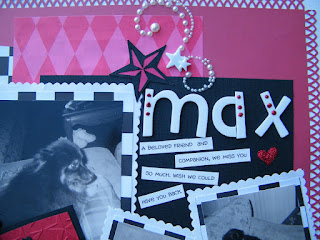
Recently, my oldest daughter moved out (very sad for me) and my hubby thought to stave off the sadness I was sure to feel, to give me the use of her room as a scraproom. Now this is a dream come true for me. I've wanted my own scraproom since I first started scrapping, although that's only been a year but I am sure every scrapper wants their own room no matter how long they've been doing it. My hubby has been real sweet about it all. This Saturday he took my shopping for furniture for the room and he let me get a bunch of decorative accents as well. Sunday, he took me to get paint for the room. He'd be helping me paint right now if he wasn't at work. He is such a sweet guy! Anyway... I'll be posting a few photos of the process: before, during, and after. Who knows maybe it will give some inspiration! You may not have a scraproom but you should make your scrap space your own! Below are the before photos! And yes, that wall is lime green and the other walls are each a different color! Also in this post; a layout I completed for a combination of challenges on scrapbook.com the Scrap Your Pet Challenge and the Scrap Your Faves Challenge (I chose to scrapliift kaye222's AHOY layout). The layout is dedicated to our dog Max. He was a loyal and loving pet, friend, and family member. Becuase of extrenuating circumstances, we had to give him up for adoption after 10 years of him being in our family. I broke down the day we parted ways. Getting teary-eyed right now! I miss him and I love scrapping the pictures we have of him. Enjoy!


This is the lime green wall that I really don't like! That green just rubs me the wrong way and to think my daughter started with the entire room that color, which I had warned her against doing. She couldn't sleep in the room, the color was so bright! Even in the dark, the color seemed to glow. She then painted each of the other three walls in neutral colors which I thought was much better. She rested easier then. lol!

This is the lime green wall (Ugh!) and the black wall. Although I never liked how this color came out because it resembles navy blue instead of black. I'll painting over this with a glossy black.

This is the door of the room and connection of the black and white walls.

Max layout. This is our dog Max. He was such a great dog. He was the only dog I ever knew that was trained to smile (thanks to my best friend Eva). We miss him every day.

Close-up of the bottom left corner and its embellishments.

Close-up of the top right corner. This shows the title and journaling a bit better.

Friday, May 14, 2010

12 Layouts of Alice - Layout #12

Wow, finally on the last layout for this little project of mine. I can say that it has been loads of fun learning new techniques! Tim Holtz Rocks! I've learned so much and have really broadened my scrapbook horizons. I will be using these techniques for a long time to come. I learned how to make grunepaper roses for this layout! So much fun! Mine don't look as good as Tim's but I think with some practice I'll get the technique down! Enjoy!
Here is Tim's tag for day #12. For more information on Tim's products, techniques, or 12 Tags of Christmas visit his website at timholtz.com.

Painting the Roses Red layout. I made some grungeboard roses; a couple were misted with a mixture of perfect pearls, Distress reinker, and water and a couple were painted with a Adirondack paint dabber. I mixed the grungepaper roses with some fabric, felt, and paper roses to have some variety.

Close up of the lower left corner: showing some of the roses and the pearl bling.

Close-up of lower right corner: showing the stamped and distressed paper. I love the technique Tim uses of stamping various designs in different colors then inking over them. It makes for such a cohesive and beautiful image.

Here is a clos-up of the top left corner. A few more of the roses can be seen including one of the grungepaper roses. I think I needed to trim it a bit. But overall I am really happy with the layout.


Supplies for this layout:

Craft Sheet
Distress Inks - Vintage Photo, Fired Brick, Antique Linen
Distress Reinkers - Fired Brick
Distress Stickles- Rock Candy
Heat Tool
Mini Mister
Perfect Pearls
Glossy Accents
Ink Blending Tool
Grungepaper
Adage Tickets
Scissors
Pearl Bling by Prima
Stamps - Script and Flourish
Fabric Roses
Felt Roses
Mini Paper Roses by Prima